14 JAN 2026
What Autistic Barbie Can Teach Us About Inclusive Design.

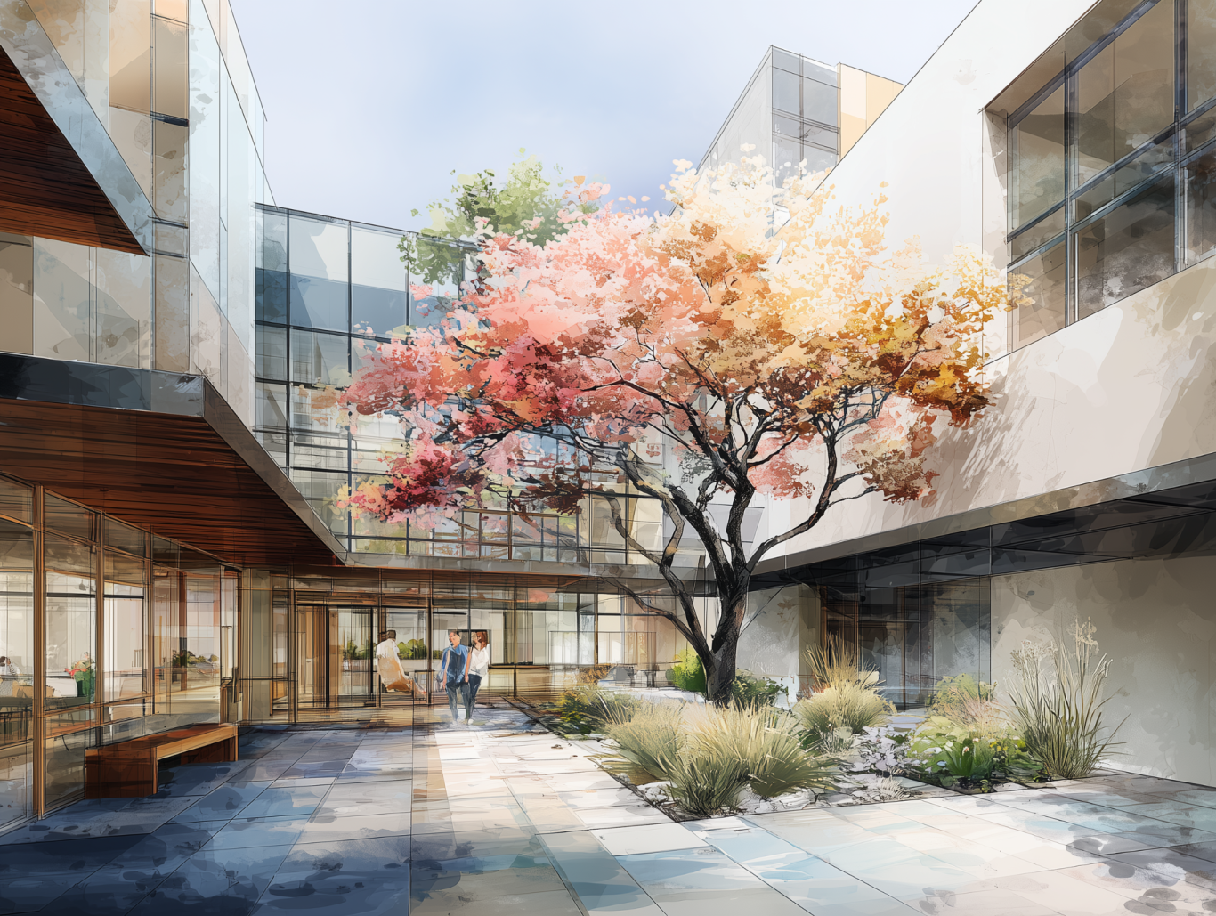
AI generated image for illustrative purposes. ©️Dawn Scott 2026.
She comes with comfortable clothing, a fidget accessory, and ear defenders. Unsurprisingly, social media has had a lot to say about it.
Some people have welcomed the representation. Others have pointed out — quite rightly — that autism, and neurodivergence more broadly, can’t be captured in a single doll.
They’re right.
But instead of asking whether Autistic Barbie “gets it right”, I’ve been more interested in what this moment reveals about how we think about inclusion — and what it can teach us about the way we design spaces.
Mattel has recently launched a new Barbie — Autistic Barbie.
Representation isn’t the same as understanding
Autism isn’t one thing.
Neither is any type of neurodivergence.
Preferences, sensitivities, coping strategies, and support needs vary hugely from person to person — and they can change over time too.
In the built environment, this presents a familiar challenge. When we design public spaces, schools, workplaces or healthcare settings, we rarely know exactly who will use them. In education especially, cohorts change year on year, bringing different needs, preferences and thresholds with them.
So how do we design environments that support people we haven’t met yet?
The design parallel
Autistic Barbie represents autism through a handful of visible cues.
In design, we sometimes fall into a similar pattern — adding a quiet room, choosing a “calming” colour palette, or specifying softer finishes — and assuming that’s enough.
But inclusive design isn’t about ticking off features.
It’s about reducing barriers.
While we can’t design for every individual preference, we can design with empathy, evidence and flexibility — creating spaces that are easier to navigate, easier to understand, and less demanding on the senses.

AI-generated images for illustrative purposes. © Dawn Scott 2026.
From awareness to understanding
This conversation reminds me of something Ben Branson, founder of The Hidden 20%, often says:
“We don’t need more awareness of autism or neurodivergence. What we need is more understanding.”
That distinction matters.
Awareness tells us that neurodivergent people exist.
Understanding asks us to consider how people actually experience the world — emotionally, sensorially and cognitively.
Inclusive design sits firmly in that second camp. It’s not about labels or optics. It’s about how environments feel to move through, occupy and use.
Designing more human spaces
Designing inclusively doesn’t start with checklists or categories. It starts with recognising that spaces are experienced by people — often in complex, unpredictable ways.
Designing more human spaces means asking questions like:
- How does this environment feel to be in?
- Where might someone feel overwhelmed, disoriented or exposed?
- Does this space support regulation, or does it require constant effort to cope?
This mindset shift moves design away from surface-level gestures and towards environments that genuinely support wellbeing and belonging.

AI-generated images for illustrative purposes. © Dawn Scott 2025.
What we already know — and should be using
Even when we don’t know every nuance or preference, we already have a strong body of shared knowledge that helps reduce sensory and cognitive overload.
For example:
- Colour and contrast:
Clear visual boundaries support navigation, safety and spatial understanding. Muted colours are often easier to process than high-chroma palettes, while stronger colours work best when used deliberately and with intent. - Light and glare:
Avoiding harsh lighting, flicker and extreme brightness changes can significantly reduce discomfort and fatigue. - Acoustics:
Reducing background noise, echo and unpredictable sound helps people focus, regulate and feel more at ease. - Materiality:
Texture, reflectivity and tactile qualities all affect how a space is experienced, particularly for those with sensory sensitivities. - Biophilic design:
Creating a sense of connection to nature in ways that feel calming rather than overwhelming — nature-inspired, not nature-dependent.
These aren’t specialist add-ons. They’re good design fundamentals.
Where inclusion really lives: choice
One of the most important lessons — from autism, from lived experience, and even from this Barbie conversation — is that choice matters.
- In workplaces, this might look like:
- normalising noise-cancelling headphones
- offering a mix of collaborative and quieter spaces
- allowing people to move, change seats or step away when needed
In retail, some supermarkets already trial quiet hours at predictable times.
In education, calmer environments are common in early years — but often disappear as children get older.
Flexible layouts, breakout spaces and genuine choice about where to sit or work can make a significant difference across many sectors.
Not every solution fits every setting — but the principle travels well.
AI-generated images for illustrative purposes. © Dawn Scott 2026.
What Autistic Barbie gets right (and wrong)
Autistic Barbie isn’t perfect. But she does something important: she starts a conversation.
She reminds us that representation is only a starting point — not the finish line.
The same applies to design. Inclusive design isn’t about finding one solution that works for everyone. It’s about creating environments that reduce barriers, support regulation, and allow people to choose what works for them.
Because people aren’t one-size-fits-all.
And neither are spaces.
Join the Colour Conversation
I’m Dawn Scott — a Senior Colour Designer and interior design expert, focused on how design is experienced by real people.
Through colour and inclusive design, I help translate what people feel into spaces that support wellbeing, understanding and belonging.y.
If you found this useful, follow me on LinkedIn and subscribe to the newsletter using the button below. You’ll get fresh insights, practical tips, and thought-provoking ideas in your feed each month.
Views expressed here are my own and do not represent those of my employer, AkzoNobel/Dulux.
Final thought
We don’t need to design for labels.
We need to design for people.
When we focus on how spaces are experienced — emotionally, sensorially and cognitively — we move closer to environments that support wellbeing, understanding and belonging.
And that’s something no single product, feature or symbol can ever fully represent.