12 DEC 2025
Is Colour Subjective… or Not?
Understanding Colour Through Both Emotion and Evidence
Colour psychology is one of the most debated topics in design.
People often want it to be simple — “Tell me which colour does what.”
Blue equals calm.
Yellow equals happy.
Green equals natural.
It would be lovely if it worked like that.
But real colour experience is far more complex.
While empirical studies give us helpful clues about how people respond to colour, those findings aren’t universal. They depend on who was studied, their culture, their sensory profile, their emotional history, and even the lighting conditions.
So is colour subjective?
Yes.
Is colour objective?
Also yes.
That tension — between how colour feels and how colour functions — is where meaningful, human-centred design actually begins.

AI-generated images for illustrative purposes. © Dawn Scott 2025.
Where Colour Is Objective: The Measurable Side of Design

While emotional responses to colour vary, certain aspects are predictable and quantifiable. And these objective elements are critical in inclusive design.
Light Reflectance Value (LRV)
LRV tells us how much light a colour reflects.
This is not subjective — it’s measurable, and it directly shapes visibility, contrast and clarity in a space.
Contrast Requirements
Guidance like UK Building Regulations Part M and British Standard BS 8300-2:2018 exist to make environments safer.
Clear contrast helps people identify boundaries, avoid hazards, and navigate spaces with confidence.
Predictability Matters
Predictable colour cues are especially important for autistic and sensory-sensitive people, who may rely on consistent visual information to reduce cognitive load.
So while feelings about colour change from person to person,
colour performance remains objective.
AI-generated images for illustrative purposes. © Dawn Scott 2025.
Why We Want Colour Psychology to Be Simple
Designers, clients, manufacturers — everyone loves certainty.
And I understand why.
It would make design so much easier if colour psychology behaved like a formula:
A → B → C.
But human beings don’t behave like formulas.
We respond to colour through layers of experience:
- Our nervous system
- Our sensory thresholds
- Our emotional associations
- Our cultural background
- Our neurotype
A bright yellow might feel energising for one person and painfully intense for someone who is autistic or sensory sensitive.
A muted pastel might feel soothing for some and low-energy or dull for others who rely on stronger visual anchors.
Colour is personal.
Colour is emotional.
Colour is sensory.
And these differences matter — especially when designing for wellbeing and inclusion.
AI-generated images for illustrative purposes. © Dawn Scott 2025.
And Then There’s How Colour Feels
This is the part of colour psychology we overlook the most — and the part where my work is most deeply rooted.
How colour feels is shaped by the body as much as the eye.
For example:
- Offices often use high-chroma brand colours that look great in presentations but feel overstimulating when you’re trying to focus.
- Schools sometimes use bright, cheerful palettes that unintentionally overwhelm neurodivergent children.
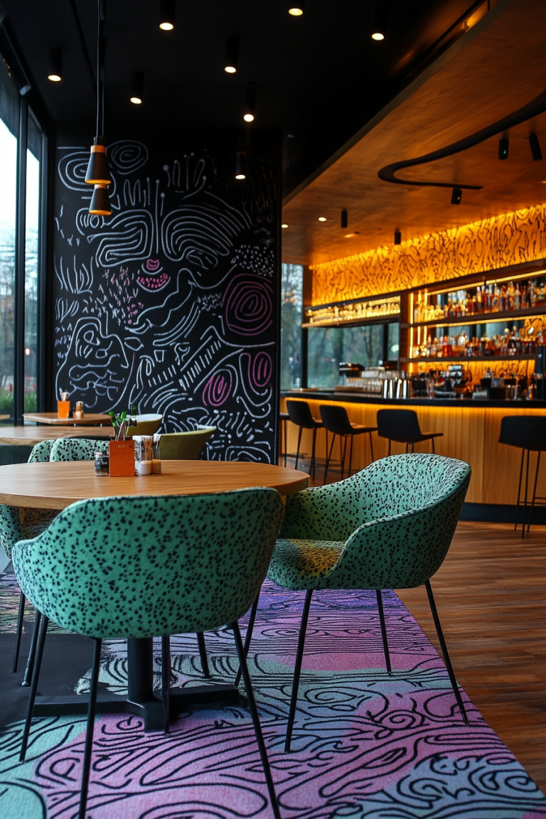
- Cafés and restaurants with low-contrast flooring and furniture may feel stylish — but create anxiety or trip hazards for people with visual impairments.
- Co-working spaces with trend-led neutrals can feel “blank” or visually confusing for people who need clearer visual anchors.
And then there’s lived experience.
As someone who is almost certainly autistic — and who parents an autistic daughter — I don’t just see colour; I experience it physically and emotionally.
Brightness, chroma, glare, and contrast can all change the way a space feels.
Colour is never just visual.
Colour is felt.
AI-generated images for illustrative purposes. © Dawn Scott 2025.
So… Is Colour Subjective or Objective?
It’s both.
And designers need to hold both truths at the same time:
Subjective colour = how it feels.
Personal histories, sensory thresholds, emotional associations, culture, neurotype.
Objective colour = how it performs.
Visibility, contrast, clarity, LRV, navigation, safety.
Great design never prioritises one over the other.
It blends emotional understanding with technical knowledge.
Because that’s how we create spaces that support comfort, connection, confidence — and belonging.

AI-generated images for illustrative purposes. © Dawn Scott 2025.
How Designers Can Work With Both Sides of Colour
Here are practical steps to start balancing colour feeling and colour function:
✔️ Ask people how colour feels
Design should respond to lived experience, not just aesthetics.
✔️ Check LRV and contrast — always
A palette can look beautiful on a moodboard and still be unsafe in reality.
✔️ Test colours in real lighting conditions
Natural light, artificial light and seasonal changes all affect how colour is perceived.
✔️ Consider sensory needs
Strong chroma, glare and brightness thresholds vary widely — especially for autistic people.
✔️ Offer choice where you can
Flexibility supports inclusion.
AI-generated images for illustrative purposes. © Dawn Scott 2025.
Final Thought
Choosing colour isn’t about finding the “right” emotion on a colour wheel.
It’s about understanding people — and how different nervous systems experience space.
Colour psychology isn’t a universal formula.
It’s an invitation to listen, observe, question, and design with intention.
When we honour both the science of colour and the experience of it, we create environments where more people feel at ease, understood, and genuinely supported.
Join the Colour Conversation
I’m Dawn Scott — a Senior Colour Designer, interior design expert, and advocate for accessible, wellbeing-focused spaces.
This blog is part of a growing library of content that supports The Colour Code — my newsletter exploring colour psychology, inclusive design and the evolving role of AI in interior design.
If you found this useful, follow me on LinkedIn and subscribe to the newsletter using the button below. You’ll get fresh insights, practical tips, and thought-provoking ideas in your feed each month.
Views expressed are my own and not those of my employer, AkzoNobel / Dulux.