03 SEP 2025
Bad Skirting, Big Impact: What a Hotel Corridor Taught Me About Inclusive Design.
Why contrast, context, and common sense matter in inclusive design.
I wasn’t expecting a quick hotel stay to become the catalyst for my most-viewed LinkedIn post ever. But sometimes, it’s the everyday details that highlight the biggest design oversights.
While waiting for a lift in a hotel corridor, I noticed something odd: the carpet didn’t stop at the floor. It wrapped right up the wall, replacing what should have been a skirting board.
At first glance, it might seem like a quirky design choice. And to be fair, I get the logic. Fewer joins mean easier cleaning and greater durability in high-traffic areas. Painted skirting in a hotel corridor often gets scuffed by suitcases and cleaning trolleys. Carpet, they might argue, can take more of a beating.
But from an inclusive design perspective? It’s a big problem.

Real-world example of poor contrast and visual accessibility in practice.
Why Skirting Boards Matter
Skirting boards aren’t just decorative. In inclusive design, they serve an important functional role in visual accessibility. For anyone with a visual impairment, the boundary between floor and wall is a key visual cue. It helps with depth perception, navigation, and overall spatial awareness.
By wrapping carpet up the wall, you remove that cue. The floor space suddenly looks bigger than it is. Edges blur. Corners are harder to judge. For people with low vision or older adults with balance issues, this can increase the risk of trips and collisions.
And it’s not just anecdotal. According to British Code of Practice BS 8300 and Building Regulations Part M, there should be at least 30 points of Light Reflectance Value (LRV) difference between adjacent surfaces. That contrast between floor, wall, and skirting is vital.
When you use a continuous material like carpet across floor and wall, you lose that contrast completely.
The Viral Reaction
I shared this observation on LinkedIn, and it struck a chord. The post had over 40,000 views, with designers, architects, optometrists, and access consultants all weighing in.
Some of the most insightful comments included:
“Sometimes it’s not a lack of care, but a lack of consultation that causes these oversights.”
“This reminds me of sanitary spaces – wet rooms, for example – where coving like this is acceptable.”
“I never thought about skirting this way before. Thank you for the insight!”
There was discussion about patterning too — one commenter noted that the bold carpet design could be overwhelming for autistic individuals, causing visual confusion and sensory distress.
Another contributor raised a point I often make in my CPDs: "Inclusive design isn’t about designing for the minority. It’s about making better spaces for everyone."
It also opened up a wider conversation around the aesthetics vs. accessibility dilemma. Some designers may prioritise a seamless visual look, unaware of the functional implications.
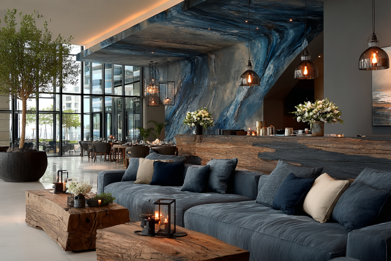
Example of good colour and contrast in a hotel lobby.
AI-generated images for illustrative purposes. © Dawn Scott 2025.

Applying the Learning
So, what can we take away from this?
✔️ Skirting boards are not optional in inclusive environments.
✔️ Contrast matters – check your LRVs when specifying surfaces.
✔️ Context is key – what works in one space (like a wet room) may not be suitable elsewhere.
✔️ Inclusive design is a mindset – it starts with understanding lived experience, not just following regulations.
I often talk about PAS 6463 (Design for the Mind), and while it’s still in guidance stage rather than regulation, the principles are clear: contrast, clarity, and consistency help everyone feel safer and more confident in a space.
The irony is, the designers and fit-out team might have thought they were simplifying things or saving money. But in doing so, they’ve inadvertently made the space more disorienting, less inclusive, and arguably less safe.
Final Thoughts
This one image sparked more conversation, learning, and connection than I could’ve anticipated. It’s a reminder that good inclusive design isn’t always about big statements. Sometimes, it’s in the small details we so often overlook.
If you’d like to explore more inclusive design insights, you can download my free guide: Top 5 Mistakes to Avoid When Designing for Neurodivergent Clients. And if you’re not already subscribed, you can also read this story in my LinkedIn newsletter, The Colour Code.
Example of good colour and contrast in a hotel lobby.
AI-generated images for illustrative purposes. © Dawn Scott 2025.
Join the Colour Conversation
I’m Dawn Scott — a Senior Colour Designer, interior design expert, and advocate for accessible, wellbeing-focused spaces.
This blog is part of a growing library that supports The Colour Code — my regular newsletter on colour, inclusive design, and how AI is reshaping interior design.
If you found this useful, follow me on LinkedIn and subscribe to the newsletter using the button below. You’ll get fresh insights, practical tips, and thought-provoking ideas in your feed each month.