04 AUG 2025
What We Get Wrong About Designing for Neurodivergent People
5 Common Mistakes in Interior Design (And What to Do Instead)
Designing with neurodivergent people in mind is thankfully starting to gain more attention — but that doesn’t mean we’re getting it right.
Even with the best of intentions, I see the same design mistakes crop up again and again. From schools to workplaces to public buildings, many spaces still fall short of supporting people with sensory, cognitive, or perceptual differences. And it’s often not because people don’t care — it’s because they haven’t been taught how.
In my work as a Senior Colour Designer specialising in inclusive design, I often combine professional insight with lived experience. I’m a parent to an autistic daughter and — let’s be honest — likely an undiagnosed autistic adult myself. So when I talk about inclusive design, it’s both personal and professional.
Here are five common mistakes I see when it comes to designing for neurodivergent people — and what we can do instead.

1. Assuming “Calm” Means “Colourless”
There’s a persistent myth that calm = beige. Or grey. Or white.
But “calm” isn’t about the absence of colour — it’s about how colour is used.
Autistic people, for example, aren’t averse to colour — they’re averse to environments that feel overwhelming, confusing or overstimulating.
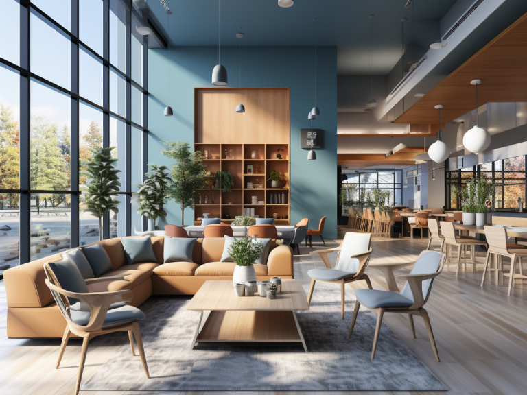
A muted, balanced palette with clear zoning can be far more calming than a blank, colourless space that offers no cues or contrast.
2. Using Grey as a “Safe” Default
Greys can feel cold, clinical, or disorienting — particularly for people with sensory sensitivities or visual processing differences.
What’s often intended as neutral ends up stripping spaces of any warmth or clarity. Instead, nature-based colours (muted greens, soft ochres, warm neutrals) offer emotional comfort and clarity when used well.
3. Forgetting About Contrast
Colour selection alone isn’t enough. It’s the contrast between surfaces that helps people interpret a space. Skirting, door frames, walls and floors all need to visually separate from one another, ideally with at least 30 points of Light Reflectance Value (LRV) difference.
Without clear contrast, people may struggle with depth perception, wayfinding, or simply feeling secure in their environment.
4. Designing for a Single Experience
There’s no one-size-fits-all “autism-friendly” solution.
Some people seek sensory stimulation. Others avoid it. Most of us fall somewhere in between — and it can change depending on the day.
The goal isn’t to find the right colour or layout. It’s to create options. Spaces that allow people to self-regulate.
Quiet zones. Flexible lighting. Surfaces that don’t glare.
Inclusion means choice, not uniformity.
5. Thinking This Is a Niche Issue
Here’s the thing: it is believed that approx 15-20% of the population are neurodivergent — and the design decisions that support them tend to improve things for everyone else too.
Designing for difference shouldn’t be treated as a specialist side project. It should be embedded in the way we approach every space — from concept through to specification.
Inclusive design isn’t about ticking boxes.
It’s about creating environments that are easier to understand, safer to move through, and more comfortable to be in — whether you're autistic, dyslexic, visually impaired, or simply someone trying to focus in a busy world.


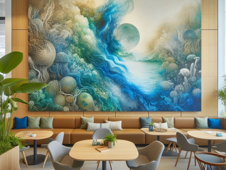
Images created by Dawn Scott using AI tools. (All content © 2025 Dawn Scott.)
Free Download: 5 Mistakes to Avoid in Neurodivergent Design
I’ve written a free 8-page guide for designers and specifiers:
“Top 5 Mistakes to Avoid When Designing for Neurodivergent Clients”
It includes visuals, practical examples, and the reasoning behind each point — ideal for architects, interior designers, or anyone working on inclusive spaces.

Want more insights like this?
Subscribe to The Colour Code — my free LinkedIn newsletter sharing practical insights on colour, inclusive interior design, neurodiversity, and AI, all grounded in lived and professional experience.